
They look alright, but I don't see that much of it is actually your work, you've just sourced some cool imagery and a few brush packs and put it together.. I'm pretty sure I've got most of those brushes lol.
Still nice arrangement and that...
Dubstep T-shirts and more
hmmm - yes and no - its really a combination of imagery and words that I find appealing - maybe its just cuz dubstep is so hated on where i am from - I am perhaps a little over zealous on pushing it to the masses.swamp wrote:They look alright, but I don't see that much of it is actually your work, you've just sourced some cool imagery and a few brush packs and put it together.. I'm pretty sure I've got most of those brushes lol.
Still nice arrangement and that...
I just really like some of these symbols and ideas - thats why i do it - to reprazent the styles i believe in.
and - once you take something and twist it enough - does it become yours? yes in music I generate a lot of sounds, and then there are those i borrow and make my own through manipulation - is this not the basis of electronic music anyway?
thanks for the compliment on the arrangements, as composition is one of my strong points.
Namaste
Vid
The Avatara VII23
Form B // Urban Anarchy
-
eshscramble

- Posts: 922
- Joined: Thu Nov 16, 2006 12:42 am
- Location: elkbeats.com
- Contact:

yes that is all it is.vii23 wrote: - its really a combination of imagery and words that I find appealing -
look at the semiotics your putting across in the images and text
(i don't like your font at all but hey its your choice)
eg - the buddha and the text nu skool ? nu skool what ? eastern vibes?
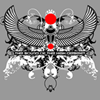
i do feel tho that in this image you have picked the best brush pack for the job and it works as a stand alone image, but seen as tho you probably didnt draw the central image its not a great feat.
some connections are made but they are too brash (the full on uk flag, bob marley, lion of judah)
if you think of dubstep musically a lot of the best references that are made are quite subtle, bare that in mind perhaps?
who has a wardrobe of soley grey t shirts ? most of these t shirt designs would not work on black and white unless u started to invert colour schemes.
having said all that - i admire the fact your willing to push your work and your giving of fairly valid reasons for wanting to do so.
blessed is the sound of the operator
I had to look semiotics up - which is a great werd by the way =]] - and i definitely appreciate your well thought out and constructive ideas.seen wrote:yes that is all it is.vii23 wrote: - its really a combination of imagery and words that I find appealing -
look at the semiotics your putting across in the images and text
(i don't like your font at all but hey its your choice)
eg - the buddha and the text nu skool ? nu skool what ? eastern vibes?
i do feel tho that in this image you have picked the best brush pack for the job and it works as a stand alone image, but seen as tho you probably didnt draw the central image its not a great feat.
some connections are made but they are too brash (the full on uk flag, bob marley, lion of judah)
if you think of dubstep musically a lot of the best references that are made are quite subtle, bare that in mind perhaps?
who has a wardrobe of soley grey t shirts ? most of these t shirt designs would not work on black and white unless u started to invert colour schemes.
having said all that - i admire the fact your willing to push your work and your giving of fairly valid reasons for wanting to do so.
Thank you I will take those suggestions to heart.
incidentally - they are not all on grey - its just the demo color - they are available on a variety of colors - though not usually white and black, true ;]]
and regarding subtleties and associations - many people I have spoken with all associate dubstep differently it seems. Some people ask for gas masks - some the lion of judah - some rasta color schemes, some skulls - it really depends on the individual it seems - put i will definitely bear it in mind to attempt to be more subtle
thanks for the comments again!
Namaste
Vid
The Avatara VII23
Form B // Urban Anarchy
 dubstep and I'll buy it.
ah man that's rude.steshine wrote:sorry but these are all terrible, very little relevance to dubstep and disgusting fonts. Just a mess really
i really like some of the designs but i don't think the text has anything to do with the motives. and i don't like the font either. it just doesn't fit to those symmetric patterns. i'd lose the text or use it in a more subtle way. i probably wouldn't wear a t-shirt that says "dubstep" or "drum&bass". (besides "psytrance" would fit better to some of the motives
Re: (
I actually know exactly what youre talking about - I may do it - but there is bunches of those out there, or at least I have seen a bunch - I am going for something a little more abstract I guess =]]plume wrote:do one that says Idubstep and I'll buy it.

(think old school I love NY biznezz)
Mad Love & Respekt from the high desert of NM!
Namaste
Vid
The Avatara VII23
Form B // Urban Anarchy
lol - well I have posted some designs on http://www.redbubble.com/people/vii23 without the text just because everyone hates my fonts.guyus- wrote:ah man that's rude.steshine wrote:sorry but these are all terrible, very little relevance to dubstep and disgusting fonts. Just a mess really
i really like some of the designs but i don't think the text has anything to do with the motives. and i don't like the font either. it just doesn't fit to those symmetric patterns. i'd lose the text or use it in a more subtle way. i probably wouldn't wear a t-shirt that says "dubstep" or "drum&bass". (besides "psytrance" would fit better to some of the motives
but let me ask all you critics this - since my fonts aren't doing it for you - which ones would?
Namaste
Vid
The Avatara VII23
Form B // Urban Anarchy
-
eshscramble
- Posts: 922
- Joined: Thu Nov 16, 2006 12:42 am
- Location: elkbeats.com
- Contact:
i don't necessarily think it's font choice- more the execution of the overall concept. i feel that you have to be a bit more cutting edge in the world of design to gain a lot of respect- because everyone can see what you're doing and make snap judgments within 1 second of seeing your work. see what people are doing, and come up with some ideas that'll make people sit and wonder how you did something. i enjoy your stuff because i can see where you're coming from. i think you're on the right track- just need to elaborate on your design style. here's a bit of inspiration for you man:
http://www.neilduerden.co.uk/
http://www.ibelieveinadv.com/
http://reformrevolution.com/
http://www.bittbox.com/
http://www.psdtuts.com/
http://cpluv.com/
http://www.smashingmagazine.com/
http://www.behance.net/
if you want more links, pm me, i have hundreds

http://www.neilduerden.co.uk/
http://www.ibelieveinadv.com/
http://reformrevolution.com/
http://www.bittbox.com/
http://www.psdtuts.com/
http://cpluv.com/
http://www.smashingmagazine.com/
http://www.behance.net/
if you want more links, pm me, i have hundreds

Black friday sale on t-shirts and hoodies
check it out - zazzle is offering 15%-30% off + free shipping - just enter the code zazzlefriday on our site when checking out and get the discount on our line of edm hoodies and shirts!
the site is at http://zazzle.com/theavataravii23
namaste
Vid
The Avatara VII23
PS havent heard my dubstep mixes - check em out - http://www.plurlife.com/vii23 or http://azedm.com/az/vii23
the site is at http://zazzle.com/theavataravii23
namaste
Vid
The Avatara VII23
PS havent heard my dubstep mixes - check em out - http://www.plurlife.com/vii23 or http://azedm.com/az/vii23
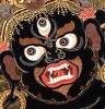
First of all, I am personally against the use of images of deceased people (Bob Marley) for self promotional purposes. Your promoting dubstep is still self promotion.
It think it is important to suggest you drop the Buddha, and Tibetan iconography. These are powerful spiritual images, and your use of them projects the fact that you have no care and respect for them. This reflects on your own mind in the forms of unawareness and detachment from yourself and your surroundings. Using these images in this way is a strong negative influence on yourself. This does not have anything to do with my opinion or critique about your artwork. It is just a fact that your imagery is general chaotic mayhem and these elements do not mix.
This does, however, go to show me that you either have a minimal sense of aesthetics, or that you are very very careless with how you create your designs (i.e. just grabbing the closest thing that looks cool and slapping it together).
Your work shows major overall imbalance, and a great many mistakes you have made using your editing software.
Please, forgive me for saying it as I see it, but are you sure you want to put a lot of energy into this? Maybe you should practice some more and develop your own style. I find it incredible that you're trying to sell this stuff. It looks to me like your first attempt at using photoshop / illustrator.
I have been making music for 10 years and haven't felt like selling anything yet. I wish to master my art first, and I believe in quality vs. quantity.
well, these are my thoughts. good luck

. . i think u mighta been goin for this guyAmmo wrote:lol. make a mala version vii23South3rn wrote:what does bob marley have to do with dubstep?
javascript:emoticon(':lee:')
. . . . clearly u got talent with design, but can the evolution of dubstep style please not get infiltrated by the whole "look i got a tattoo on my t-shirt" syndrome thats currently sweeping the US? try to avoid the leafy fractal backdrops is what im sayin, and use symmetry sparingly. definitely some interesting ideas wit some of these, concentrate more on the content though.
(Code Of Arms / Industrial Strength Records / Dubbhism / Betamorph / Filthy Digital / Gamma Audio / Konkrete Jungle NYC )
http://soundcloud.com/sorokabeatz
BRAND NUBIAN : Enter The Dubstep CD in stores NOW!
http://soundcloud.com/sorokabeatz
BRAND NUBIAN : Enter The Dubstep CD in stores NOW!
Also gotta agree with Earthling's words . .
. ... think about advancement
. ... think about advancement
(Code Of Arms / Industrial Strength Records / Dubbhism / Betamorph / Filthy Digital / Gamma Audio / Konkrete Jungle NYC )
http://soundcloud.com/sorokabeatz
BRAND NUBIAN : Enter The Dubstep CD in stores NOW!
http://soundcloud.com/sorokabeatz
BRAND NUBIAN : Enter The Dubstep CD in stores NOW!
Who is online
Users browsing this forum: No registered users and 0 guests