Page 5 of 6
Posted: Sat May 19, 2007 7:18 pm
by struggle
"a look" for dubstep doesn't interest me in fashion or imagery, but i guess it's inevitable. i try to stay far away from all that.
i personally like images that are dark or creepy. here are some flyers for subsistence...


Posted: Sat May 19, 2007 7:20 pm
by bunzer0
struggle wrote:"a look" for dubstep doesn't interest me in fashion or imagery, but i guess it's inevitable. i try to stay far away from all that.
i personally like images that are dark or creepy. here are some flyers for subsistence...
out to DJ COLLAGE !
Each and every !
Posted: Sat May 19, 2007 8:16 pm
by surr
I reckon that the Boka logo depicts dubstep quite well:

Posted: Sun May 20, 2007 11:33 pm
by mezi
Posted: Sun May 20, 2007 11:40 pm
by two oh one
drew wrote:I hope dubstep never gains a certain look or fashion.
What I love about it is the anti-genre attitude. Everything falls under the umbrella of dubstep, and each person brings their own influence into it. From the producers, to the party goers - everyone can find something they like and everyone can inject their own personality into it
Im a vj myself, and Ive never done visuals for a dubstep show. I feel like people should use their own imagination and let the music inspire you - create your own mental images. Once you put that on a screen, you are telling people what to think - it takes away part of the fun.
As far as design goes, we've done a lot of distressed textures and distressed type - urban landscape themes, or rusted metals - sometimes its a throwback to the industrial, nine inch nails, gunge design style... inject some color and clean type over it - thats been more the theme for the SMOG flyers, not trying to create a look for the music itself.
Id also say a walrus with a bucket cant ever go wrong
What he said.
Posted: Mon May 21, 2007 7:47 am
by thebastard
Posted: Mon May 21, 2007 1:31 pm
by interzone
and what about asian drawings and woodprints?
especially those of japanese warriors are amazing! they seem to fit dubstep well.. we think that is;)
Posted: Mon May 21, 2007 1:42 pm
by dr.benway
from wot I can gather fashionwise its like explosion ina charity shop....
Posted: Mon May 21, 2007 2:39 pm
by staas
stencilly stuff over bold colors seems to show up


maybe just me making a bigdeal over slight differences
edit: they won't show up, right click view image

Posted: Mon May 21, 2007 4:48 pm
by lone wolf
The Image is freecasing man. Get with it.
 http://www.youtube.com/watch?v=fhQ5cYLraBc
Posted: Mon May 21, 2007 5:05 pm
by misk
wheres the helicopters?!

Posted: Mon May 21, 2007 6:35 pm
by struggle
dubstep soldiers repelling from helicopters w/subwoofers strapped to their backs..oh and camouflage lions in the background.
Posted: Mon May 21, 2007 6:49 pm
by dr.benway
Posted: Mon May 21, 2007 7:04 pm
by junglist movement
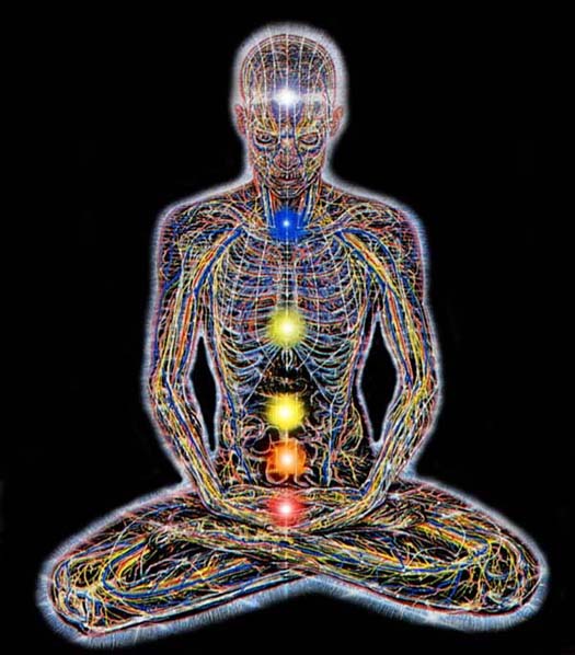
Some of banksys stuff, dark, to the point. Like our very own dubstep.


Posted: Mon May 21, 2007 7:27 pm
by norris norisk
I´m going with the image-makes-the-scene-specific thing.
Dubstep is like turning the rotten into hope. Humans coping with human problems, decaying cities, war, terrorism, contermination of enviroment.
Also the more anti hero is to be the good guy image. More nerdy and skinny then bling and pumped up...not that hooded body politics of baggy clothing.
It´s the realist and aware of fatality guy being the last resort of humanity/ creativity/ emotion on a spoiled earth.
Indeed the background is an urban one, in a more "endzeit" style. All objects made by mass producing systems are signifiers of that urbanity and modernity. Exposed in black and white, they are getting that differance to the highresolution in 64 million colour standard. So they can turn out to a kind of reception of their otherness.
I do like the artwork of Various Productions releases, even if they are very feminin and nearly no high tech stuff is shown, but what about the erotic symbols of the girls: lingerie, make up? And the animals taking control of humans? But have a look to the video of hater:
http://www.youtube.com/watch?v=UA1DuuJ6ymc
and there is a video to Kode 9 Samurai (?), but didn`t sort that out.
I`m excited where dubstep is going to...
cheers
Posted: Tue May 22, 2007 9:54 am
by mezi
Posted: Tue May 22, 2007 10:04 am
by dj phonetic
two oh one wrote:drew wrote:I hope dubstep never gains a certain look or fashion.
What I love about it is the anti-genre attitude. Everything falls under the umbrella of dubstep, and each person brings their own influence into it. From the producers, to the party goers - everyone can find something they like and everyone can inject their own personality into it
Im a vj myself, and Ive never done visuals for a dubstep show. I feel like people should use their own imagination and let the music inspire you - create your own mental images. Once you put that on a screen, you are telling people what to think - it takes away part of the fun.
As far as design goes, we've done a lot of distressed textures and distressed type - urban landscape themes, or rusted metals - sometimes its a throwback to the industrial, nine inch nails, gunge design style... inject some color and clean type over it - thats been more the theme for the SMOG flyers, not trying to create a look for the music itself.
Id also say a walrus with a bucket cant ever go wrong
What he said.
2nd
Look at the Dubstep allstars covers and Skream! cover.... Neutral like it has to be.
Posted: Tue May 22, 2007 10:44 am
by horse
not just a cover that perfectly sums up the sound on the disc but also IMO one of the best pieces of cd artwork ever
[/img]
Posted: Tue May 22, 2007 12:27 pm
by ozols man
why the hell do people keep on emntioning nerdy and skinny. dusbteppers got some self hate issues lol! there should be no manufactured image cos the scene is a bit like a democracy, everyone comes down, busts the garms they want and thats it, the people make the "image"...
Posted: Tue May 22, 2007 1:03 pm
by victorxray
paolo wrote:
where's misk, that hand avatar of his is a dead ringer for the cover of the three stigmata of palmer eldritch, only upside down with colour;