Page 1 of 2
Dubstep - flyer feedback please!
Posted: Wed Jun 06, 2007 5:49 pm
by soundbwoy
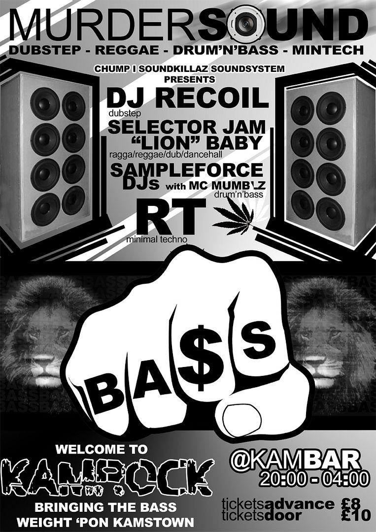
Not sure when/if the event is actually happening, but looking for feedback on the flyer.. it's not finished, the bottom needs some work. Any ideas? Would've done it in Rasta colours obviously, but he wants black and white :[
Still. It has lions

Posted: Wed Jun 06, 2007 6:08 pm
by vonboyage
Reh.. thats quite good una.
I like the black n white still !
Posted: Wed Jun 06, 2007 6:10 pm
by metalboxproducts
Nicked the title of one of my tunes i see.

Posted: Wed Jun 06, 2007 6:10 pm
by vonboyage
Lol what tune was it ?? And can i get that on lay-away ?

Posted: Wed Jun 06, 2007 6:11 pm
by soundbwoy
I was told what to write!
Which bits your tune?
Posted: Wed Jun 06, 2007 6:13 pm
by metalboxproducts
Murdersound. lol Not bothered mate it's all good.
Posted: Wed Jun 06, 2007 6:15 pm
by vonboyage
I detected abit of the classic
WHODUNNIT tension there for a sec.
Copperpot send that my way
(if you can)
Posted: Wed Jun 06, 2007 6:20 pm
by soundbwoy
I think that's standard bass culture terminology though isn't it? Apologies either way, hope you don't mind too much =)
Re: Dubstep - flyer feedback please!
Posted: Wed Jun 06, 2007 6:25 pm
by human?
soundbwoy wrote:Any ideas? Would've done it in Rasta colours obviously, but he wants black and white :[
Still. It has lions
hmmm. why obviously? just wondering.
imo, it would be a better design without the lions.. some design outlines around the fist, like you have around the speakers would be fresh...
one
human?
Posted: Wed Jun 06, 2007 6:28 pm
by soundbwoy
because they're such awesome colours. but yeah maybe stick with the dark theme and embrace the black/white.
and interesting about the lions. I love lions so I'd be quite hesitant, but I'll check it out
thanks for feedback
Posted: Wed Jun 06, 2007 6:40 pm
by ory
.
Posted: Wed Jun 06, 2007 7:25 pm
by bob crunkhouse
i like it mate, lions are a bit blurry though.
im quite happy with our new flyer!
<a><img></a>
i reckon the diffrent strokes nights have the best flyers, that new baguette ones wicked, think teh lolly is my fave though
Posted: Wed Jun 06, 2007 7:30 pm
by soundbwoy
Ory wrote:I reckon the lions are too blurry to work with the rest of the very sharp design. So if you used a pair of lions with proper contours it'd work.
ahhhh why didn't I see this.
thanks
Posted: Wed Jun 06, 2007 10:19 pm
by classagraphics
personally its a bit too scattered, the only thing that pops out is the fist, which is pretty cool except i dont understand the $ sign. like the white around black lettering and different sizes and different alignments, all makes me lose focus. also arial sucks as a font in my opinion, and should only be used as arial black and tight together or used as text for explanation or something.
on the plus side, its similar to most the dancehall / reaggaeton party posters i see in posted up around amsterdam. anyways, i'd say just rearrange it a bit, and focus on the dj names, not the fist and lion.
Posted: Wed Jun 06, 2007 11:04 pm
by metalboxproducts
soundbwoy wrote:I think that's standard bass culture terminology though isn't it? Apologies either way, hope you don't mind too much =)
I was kidding man. I really don't care. It was just a flip remark. No bigie.

Posted: Wed Jun 06, 2007 11:07 pm
by metalboxproducts
Vonboyage wrote:I detected abit of the classic
WHODUNNIT tension there for a sec.
Copperpot send that my way
(if you can)
Will do man but, it's up for a recut coz there are somethings i don't like about it. I'll still send it to you though if you want.
Also, need to speak to you about pressing a few of your tunes.
Re: Dubstep - flyer feedback please!
Posted: Wed Jun 06, 2007 11:09 pm
by RubiconMan
soundbwoy wrote:Would've done it in Rasta colours obviously, but he wants black and white :[
Still. It has lions
send him here to print
http://www.opus-print.co.uk/prod_flyers.php
in most places it aint much more for colour.
on a dezine tip, i like it, only thing is make the date an names more of the focus...vague enuff for ya?
Posted: Thu Jun 07, 2007 9:06 am
by dandy
id personaly take out the speaker on the O of sound and the weed leaf, dont really need to photoshop on all the marks of a dubstep party. bt ey thats just my opinion!
Posted: Thu Jun 07, 2007 9:07 am
by j_j
need more spliffs n speakerstacks on that flyer..its totally letting dubstep down.
the jah lions are ok...but put spliffs in their mouths.
Posted: Thu Jun 07, 2007 9:17 am
by forensix (mcr)
Definitely needs more dub/reggae cliches, why not put a rasta smoking a spliff on it