Page 1 of 1
RECORD COVER ARTWORK - Feedback
Posted: Mon Apr 30, 2012 10:02 am
by jcb
As a part of my final year university project I am re-designing and branding a well known netlabel. For those who don't know what a netlabel is, it basically distributes free music licensed as creative commons through the internet. I thought it would be interesting to take music which is usually digital, and transform it into a vinyl format, creating new artwork and branding, catering to a different target audience.
As the music is often free, the challenge is to make the artwork desirable enough so people actually buy the records, so I would like some feedback on what you like (or don't). I know there are a lot of vinyl heads on this forum, and sometimes in a shop you listen to a record just because it has interesting artwork. So yeah, let me know what you think. Thanks!
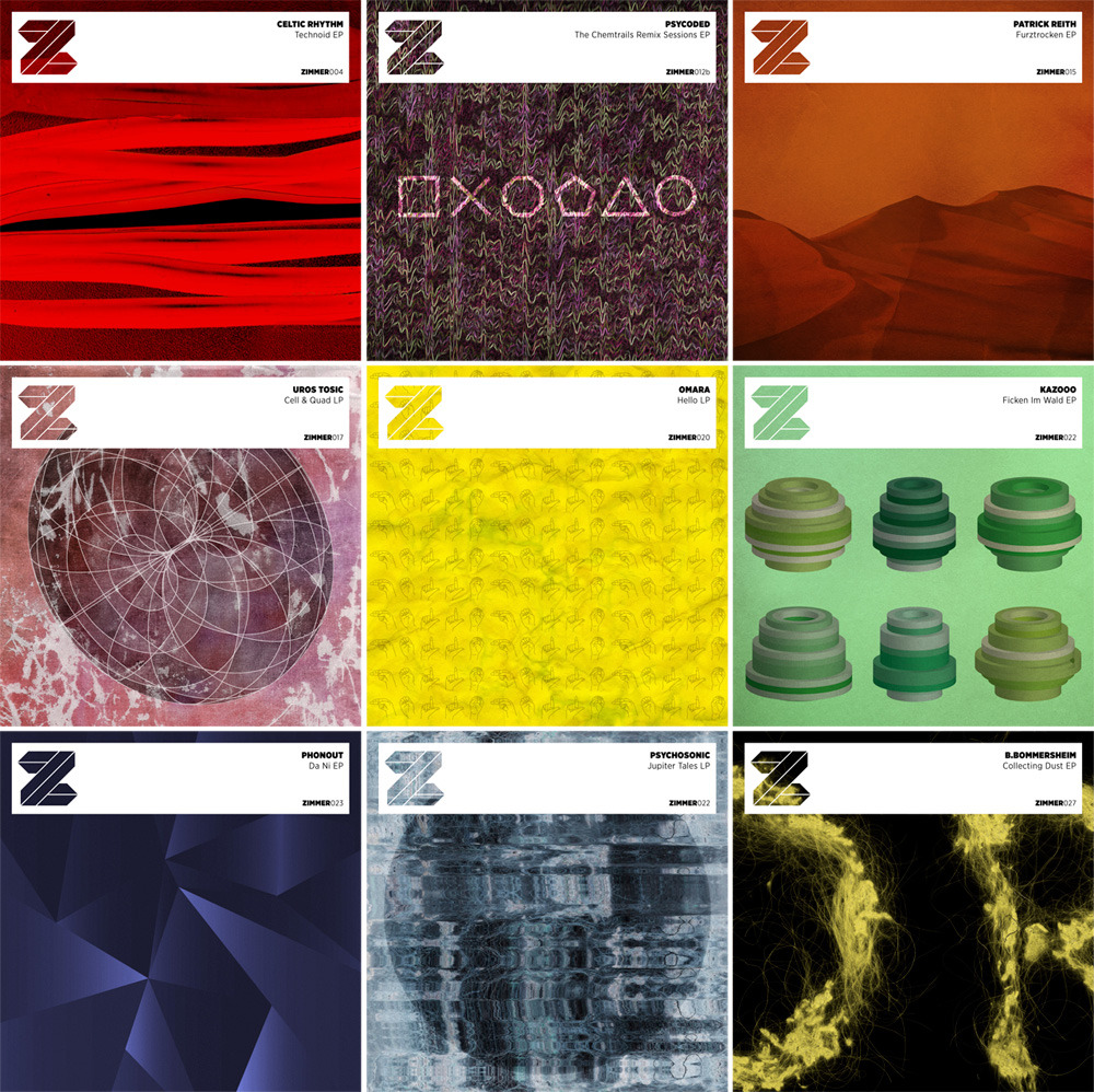
My re-design and re-branding of the artwork.
The original, weird, black and white artwork.
http://payload.cargocollective.com/1/1/ ... inal_o.jpg
Re: RECORD COVER ARTWORK - Feedback
Posted: Mon Apr 30, 2012 10:27 am
by apmje
Feeling it mate. Looks smart.
Not sure which one I prefer...probably the originals though. But I like yours too!

Re: RECORD COVER ARTWORK - Feedback
Posted: Mon Apr 30, 2012 1:46 pm
by dubloke
yeah yours look good, remind me of the nightslugs layout
Re: RECORD COVER ARTWORK - Feedback
Posted: Mon Apr 30, 2012 3:12 pm
by d-T-r
I like them all.
be sure to get some life-size sleeves made and take photos of those to get a better idea of how they would look if they were scaled up (if you havn't yet)
i think the bottom ones could do with some coloring some how?-- nothing crazy just some colour overlays over each of them and maybe making them all a part of coherant colour pallet sequence.
good stuff though- stick em in the artwork thread and more people may see them
http://www.dubstepforum.com/viewtopic.php?f=7&t=22951
Re: RECORD COVER ARTWORK - Feedback
Posted: Mon Apr 30, 2012 3:31 pm
by jcb
Thanks for the feedback! I will be getting them printed full size, and mocked up so they look like vinyl sleeves. I'm thinking of getting some labels printed as well to stick on the actual vinyls.
Some of the images may seem fairly random, but they are all related to the music or name of the record.
For example:
'Collecting Dust EP' is made up of images of dust and hair which I created from scanning the contents of a hoover bag.
'Furztrocken EP' was created from folded bed sheets which were photographed in a way that they looked like sand dunes (Furztrocken means dry as dust, bone dry etc.)
The symbols of 'Hello LP' are the hand signs used to spell the word hello in sign language.
'Jupiter Tales LP' was created from scanning foil and reflective fibres to give an effect which looks similar to the patterned surface of jupiter.
I tried lots of different experimental techniques to create the artwork, since the music is very creative, experimental and original.
Re: RECORD COVER ARTWORK - Feedback
Posted: Mon Apr 30, 2012 3:33 pm
by Pedro Sánchez
The originals look generic, if your own had a little more depth and detail (some look a little 'rough draft'y), with a better choice of font and title positioning (the semi opaque white with thin black text over-layed is a little harsh), I would go with yours every time.
Re: RECORD COVER ARTWORK - Feedback
Posted: Mon Apr 30, 2012 3:40 pm
by kay
I like them all, overall, especially the chessboard. A couple of them look a bit messy but I think that's the raw(?), kinetic look you're trying to achieve. Some of the title bars don't stand out enough and could potentially make them difficult to identify.
Re: RECORD COVER ARTWORK - Feedback
Posted: Mon Apr 30, 2012 3:46 pm
by Naan_Bread
I like how you've carried through the psychedelic/surrealist theme and overall I think you've done a really great job but some of it feels a bit incomplete if the artwork is the main point of sale. "Psycoded" and "Uros Tosic" in particular are really great though.

